Slash Battles
Date
2024
Skills Applied
Game Design, Programming, Business
Client
Self-Employed

Overview
Slash Battles is a fast-paced PvP brawler where players use weapons and special abilities to knock opponents off hazard-filled maps
I led the user inferface design and frontend development, focusing on a clear, competitive interface that scaled across devices.
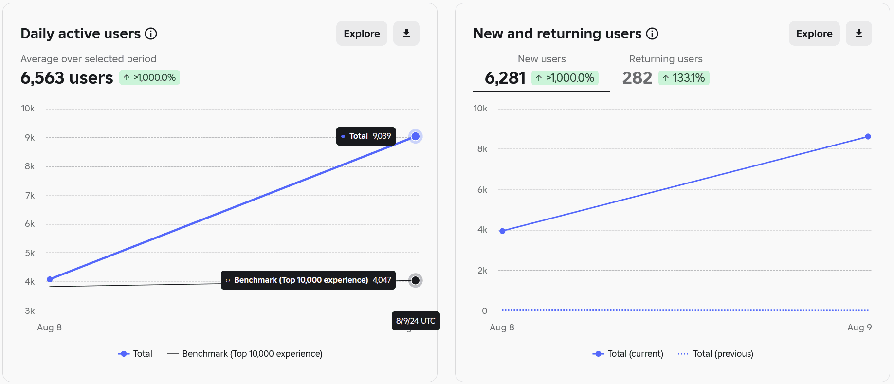
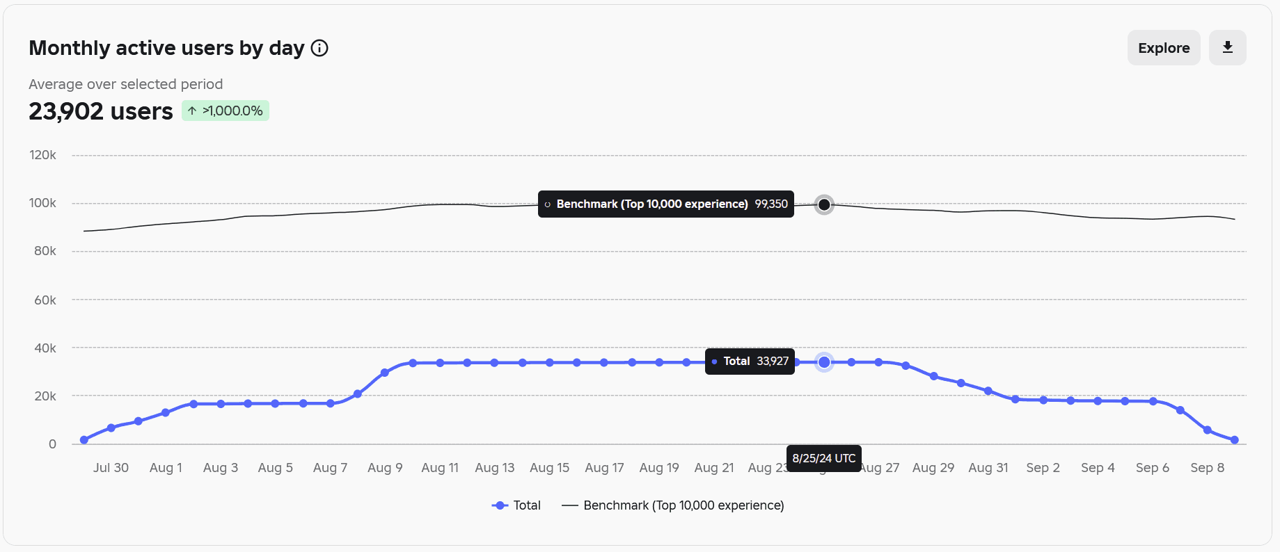
Through a Waterfall Model, Usability Testing, A/B experiments and community feedback via Discord. Additionally focusing on marketing, advertisement, collaborating with stakeholders and players (users) to publishing a game that reached over 58,000 visits within 3 months and accumulated:
Over 9,000 daily active users (August 9th)
Over 39,000 monthly active users (August)
Rationale
The aim of Slash Battles was not fix an issue or compete with the leading games such as Tongue Battles, Slap Battles, which all amassed millions of players over a short span on the platform (Roblox).
But instead, using those successful games as a mental model and offer Slash Battles to users as an alternative, co-existing and innovative option that combined ideas from those other games.
The Team
The Team consisted of 3 (including myself) experienced multi-disciplinary developers, who were also Product Owners that engaged in the full planning, development and implementation of the final product.

As a small indie studio with a limited budget, we did not have the resources to hire other full-fledged developers and designers, therefore any time we needed resources outside of our expertise (animations, particle effects, sounds or specific art- we could contract an individual for a one-time payment/commission based request.
For the scope of this case study, we will be primarily focusing on my role and contribution as a Front-end developer and UI/UX designer for this project.
Research Method
Competitive analysis involves evaluating similar products to identify their strengths, weaknesses, and user experience gaps.
How was this to be achieved?
By playing successful games (Slap Battles, Tongue Battles) to assess where they were lacking, what could be better and how we could offer an alternative that is similar to their game but better in addressing the issues that their current player base may experience, through this, we found issues such as:
Poor Gameplay: Movement system and main combat felt a lack of response when inputs were pressed, showing signs of poor local to server optimisation
Expensive Monetisation: The ratio of items received to the price paid such as Tongue Battles Bundle (400 RBX) seemed costly, we believed we could offer gamepasses and developer products for half of that price.
Lackluster UI: UI's were very basic (which can sometimes be a good thing) but they lacked basic UX principles such as colour and labels to differentiate the buttons.
These were only some of the issues that we discovered in our competitive analysis, which we planned to address, along with other adding our own ideas and twists to still produce a new final product.
Design Goals
To minimise adversity, we established basic design goals and pain paints backed by our research method:
Consistency in style and iconography
Functional clarity, especially for mobile/console users
Scalable layouts for modular systems (e.g. shops, quests, dailies)
Clear separation between gameplay UI and system/meta UI (Law of Proximity)
With these goals, concerns and pain points illustrated, the ideation and implementation of UI's began.
Implementation
Due to time constraints and my familiarity with both the platform and design goals, we skipped traditional wireframing and moved directly into high-fidelity UI construction within Roblox Studio, Photoshop and Figma.
UI Components:

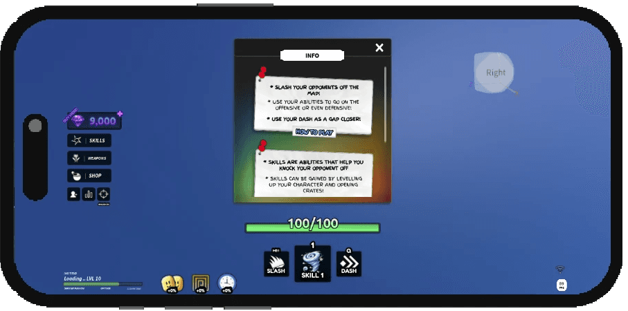
Main Hub
Slap Battles Ver: The competitors Hub screen lacked adequate labeling, users may have to take longer to process what each button does
Slash Battles Ver: In light of this, our Hub gives textual value to the labels for users to understand what each button means without having to potentially guess.


Powerup UI: Pop-up modal for in-match boosts with cooldown indicators.
Skill UI: Icon-based skill selection UI with preview effects, cost display, and contextual tooltips for each ability.
Weapons UI: Horizontal weapon grid with rarity tiers and stat previews, enabling users to equip and compare loadouts.
Titles UI: Scrollable achievement-based titles menu with locked/unlocked state indicators tied to leaderboard status.

HUD UI: Minimalist combat interface displaying real-time health, active ability icons, and keybinds for quick in-battle decision-making.
Iteration
Old Daily Rewards Screen:

Redesigned the daily rewards UI from a linear scroll layout to a visible grid, improving cognitive mapping and motivation by showing all 14-day rewards upfront—boosting engagement through clearer progression incentives.

Upgraded from a one-row scroller to a full grid layout so players can instantly see all daily rewards including rare final items, therefore encouraging continued play without extra scrolling.
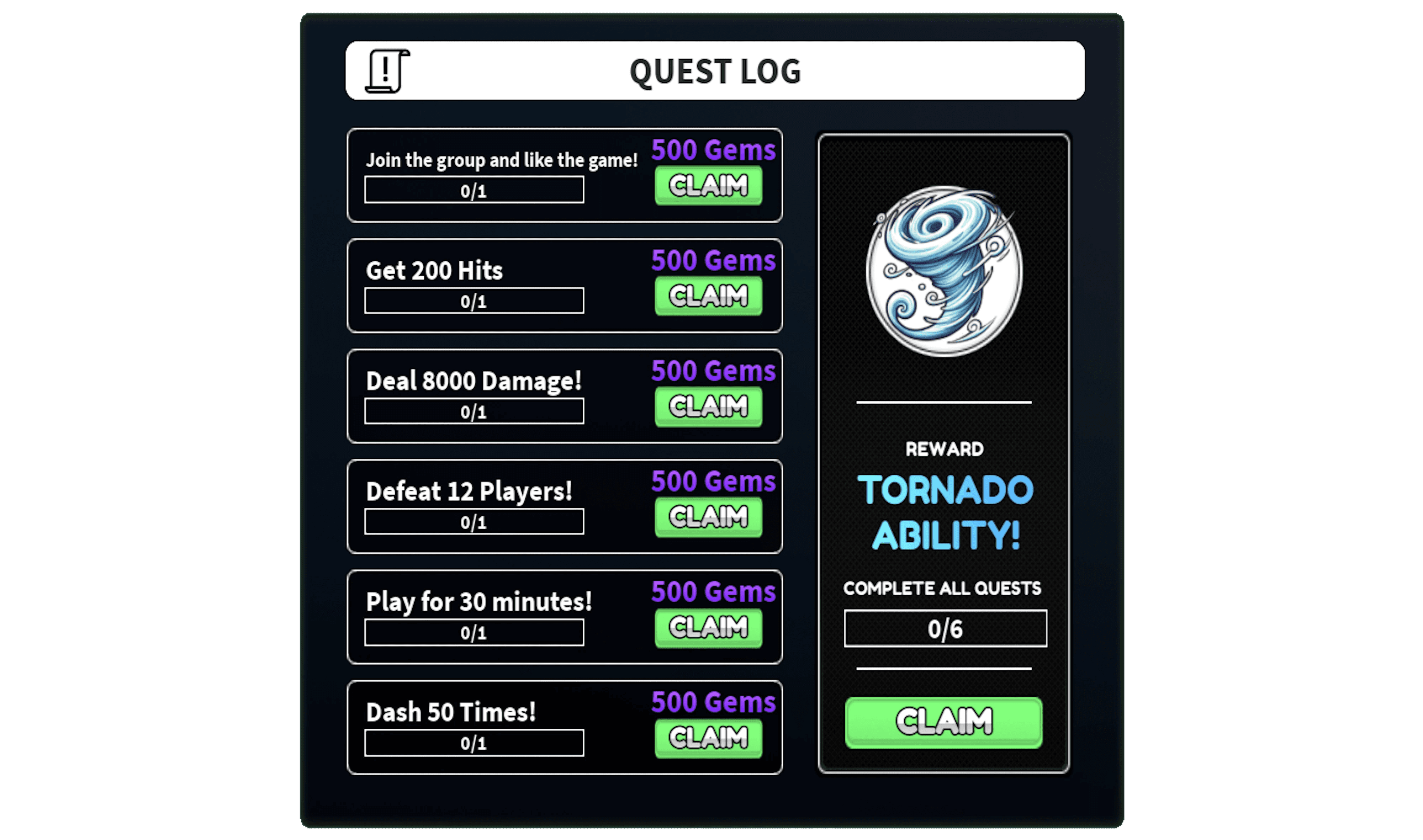
Quest Log UI: Task tracker with progress bars and reward display.

Code UI: Code redeem UI with success/fail animations, accessing.
Testing
When creating the final UI versions, we moved onto testing, specifically:
A/B Testing
Compatibility Testing Across Mobile, Tablet and Computer.
A/B Testing
We conducted an A/B test between two Gem Shop UI variants:
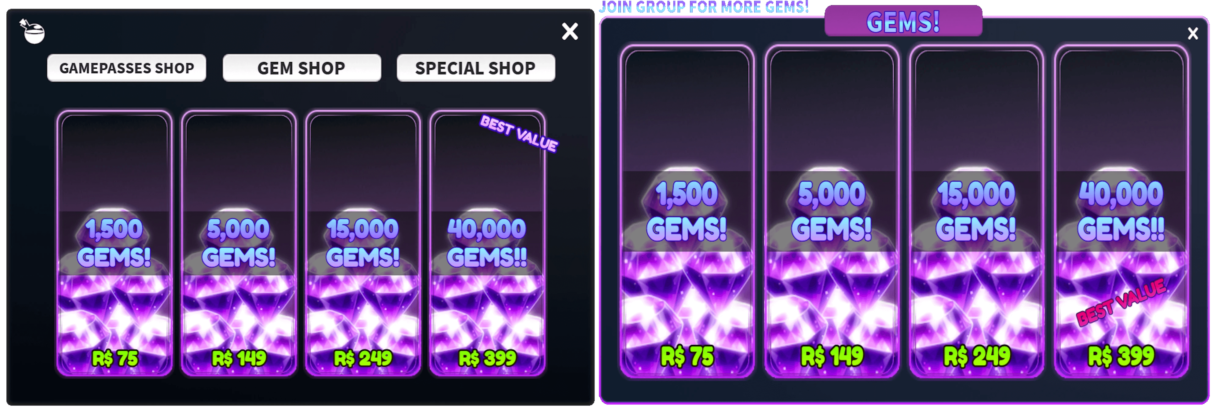
After review with the dev team and user feedback, Option A (left) better supported Jakob’s Law by aligning with UI patterns seen across our game, and its segmented design allowed clearer mental models around monetization categories. Engagement with the “Best Value” bundle increased following this revision.
Compatibility
Ensuring that the game is compatiable for all users across multiple devices is essential in fostering an inclusive game that can reach the highest amount of users possible.
Phone:
Tablet:
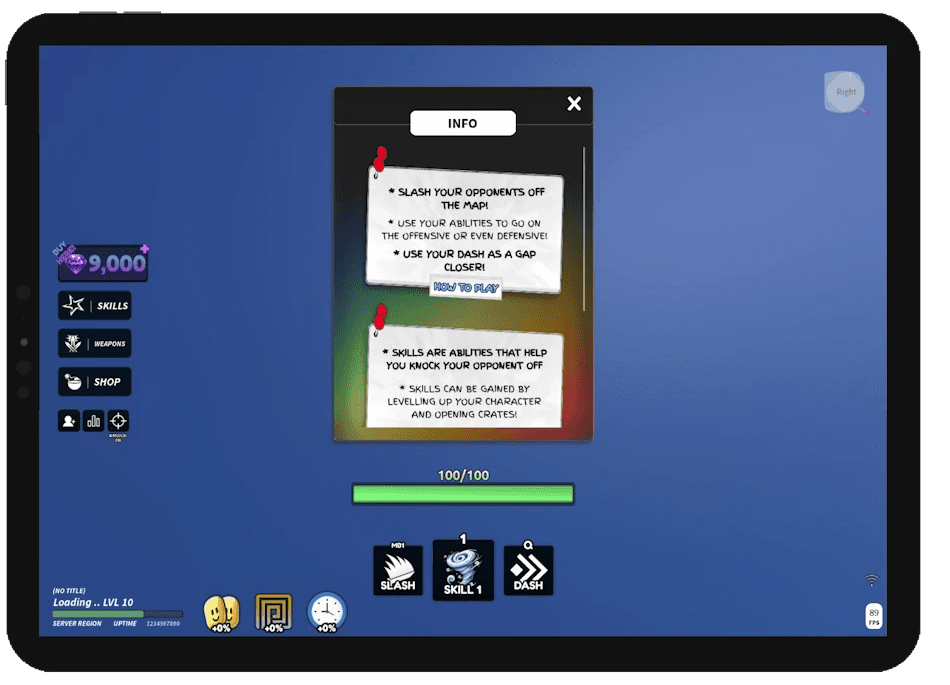
Computer:

Through compatibility testing with different devices and device types (iPhone, Android, Google)- the UIs were deemed acceptable across all devices.
Monetisation
Our strategy support long-term sustainability, we implemented a balanced monetization model using Roblox Gamepasses and Developer Products, designed with user value and retention in mind.
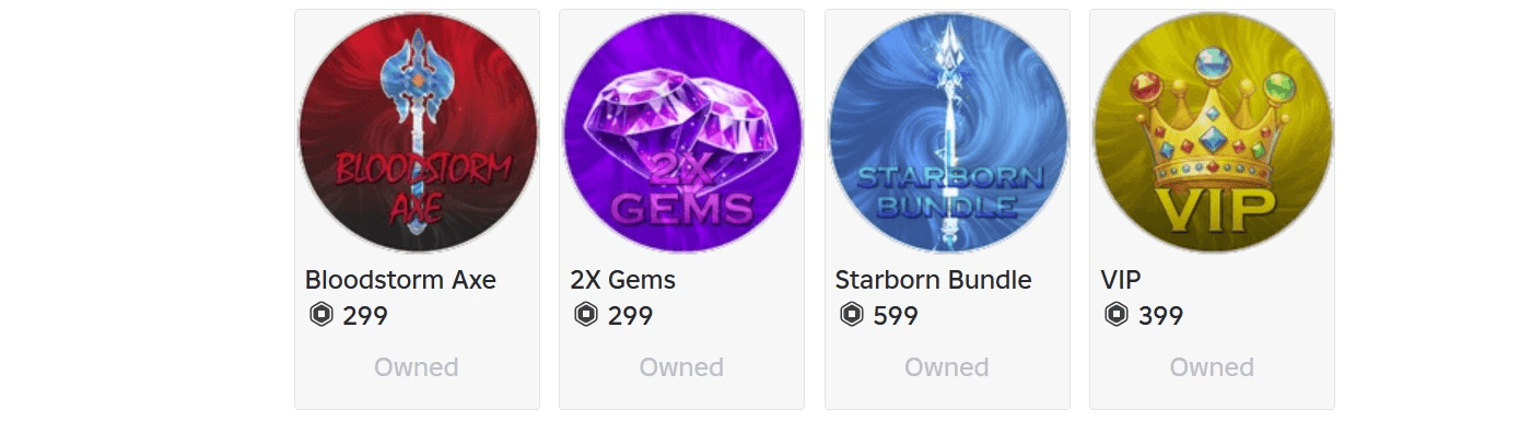
Bloodstorm Axe: A powerful exclusive weapon with a unique visual style and gameplay advantage. Offered as a one-time premium purchase to boost player power and stand out visually driving early monetization from competitive users.
2X Gems: Sold in bundles and used as a core in-game currency for upgrades, cosmetics, and powerups. As a repeatable purchase, Gems were a key driver for ongoing revenue and were paired with high-value bundles to encourage conversion.
Starborn Bundle (Limited Offer): A high-tier special offer containing rare cosmetics and weapon skins. Designed with urgency and exclusivity in mind, limited bundles like these increased player incentive through FOMO and differentiated high-value users.
VIP Gamepass
Offered long-term value with:
A custom VIP player title
One-time reward of 5,000 Gems
Daily VIP Chest to incentivize retention
Positioned as a hybrid between status and utility, the VIP pass rewarded loyalty while increasing log-in consistency through daily mechanics.
Results & Key Metrics
Following release, Slash Battles saw rapid traction, driven by user-focused UI and monetization strategy:
9,000+ peak daily active users (Aug 9th-July-31st) — a +1000% increase over baseline
39,000+ monthly active users — outperforming indie benchmarks in just 3 weeks
7.6 min avg. session time — 255% above prior project, indicating strong UX flow
35.95% first-session retention — well above the Roblox average (~20–30%)
Increased “Best Value” bundle engagement post-A/B testing of monetization UI
Gradual decline in longer-term retention (D7–D30
Reflection & Final Thoughts
Slash Battles success was short-lived, although it amassed some impressive stats- as a small team with still a limited budget competing against "giant" games, we were unable to consistently produce updates at large scales. Additionally, there were mistakes made in the final product, as we assessed our declining retention rates, it was clear that:
Map Quality: To save budget, we chose not to outsource our map, opting to build it in-house but this led to a lower-quality environment that couldn’t visually or functionally compete with top-tier competitors.
Monetization Depth: Our monetization relied heavily on one-time Gamepasses; in hindsight, adding recurring systems like Battlepasses or limited-time events would have driven better long-term engagement and revenue.
Advertising Strategy: We invested heavily in TikTok and YouTube Shorts outreach, but this was financially inefficient, ads on Roblox itself would have better targeted players actively browsing for new games and improved organic discovery.
However short-lived, the experience over the span of several months was educational and breath-taking, to start with a vision and manifest it through business, user experience, game development and collaboration with partners into a full-scale project and users played was exhilitrating. I learnt a lot from this process and UI/UX designer in this project, it most definitely fueled my passion in creating more things that users can engage with and hopefully enjoy.