
Overview
Virtubank is a thoughtfully designed banking app aiming to transform financial anxiety into confidence. With its minimalist interface, calm teal-to-indigo gradient, and transparent branding symbolized by a crystal-shaped logo, Virtubank fosters trust, clarity, and ease of use. The app leverages cognitive design principles to simplify financial management and ensure a frictionless user experience.
Problem
Today's banking apps often add stress to our already busy lives. Many people, especially students and young adults, feel anxious when checking their accounts—confronted by overdraft alerts, unexpected charges, looming bills, and financial uncertainty. This anxiety isn't just about the numbers; it's amplified by cluttered screens, overly complicated layouts, and harsh visuals that intensify a feeling of panic rather than reassurance.
Solution
Virtubank addresses these common stressors head-on, offering a banking experience thoughtfully designed to ease users into managing their finances calmly and confidently.

Opening the app feels like a gentle sigh of relief. Users are greeted by a serene gradient that flows smoothly from calming teal into soothing indigo, carefully chosen colors known to evoke trust, calmness, and clarity. This peaceful visual environment immediately helps to lower stress and reduce cognitive overload, allowing users to focus effortlessly on their financial tasks without unnecessary distractions.
Transaction Screen
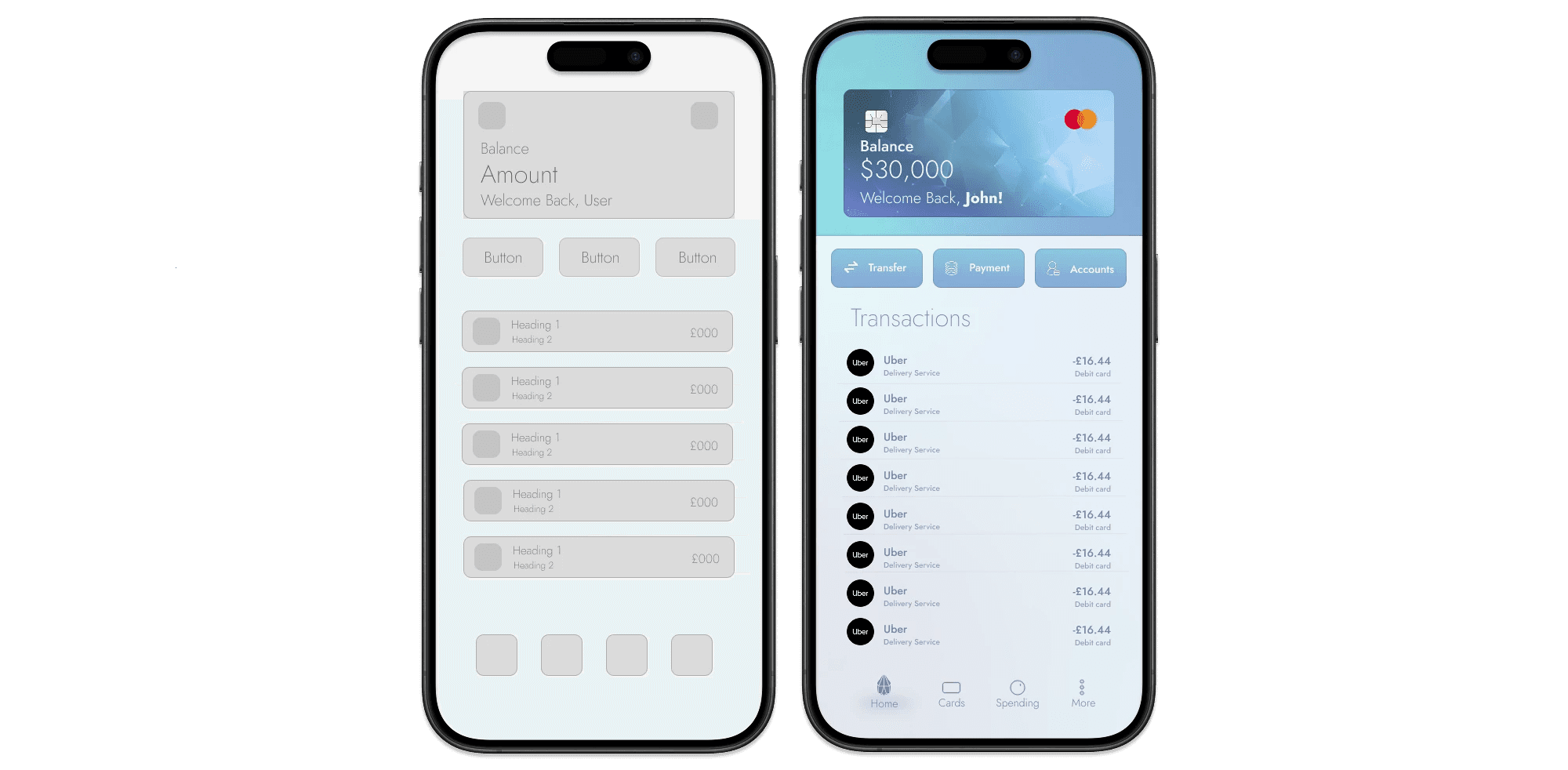
Description
A clean two-column list with logos and right-aligned amounts lets users skim transactions effortlessly against the calming gradient backdrop.
Design Process Highlights
Wireframe: complied a monochrome wireframe (left) that fixes the vertical rhythm: balance card → primary actions (Transfer, Payment, Accounts) → running transaction list → tab bar. Helps establishing information hierachy and sizing for the components (e.g. buttons,)
Crystal visual theme: stationed a crystal-blue gradient from physical card concept to reinforce brand and give the card a theme of solidity and firmness, resembling the unbreakable trust that the brand wants to reinforce.
Visibility of system status: here, we ensure that the user is informed that and has full control of their interface (e.g. check balance, send money, scan recent payments.)
UX Principles Applied
Gestalt Proximity: Balance card, quick actions, and transaction list each sit in their own vertical container with spacing and distinct contrasting colours. Users instantly understand they’re distinct functions without extra dividers or labels.
Minimise choice reaction time: Applying Hick's Law primary actions (Transfer, Payment, Accounts) are equally sized and left-to-right, so users decide in one glance instead of scanning a dense menu and potentially triggering cognitive overload for the user.
Cards Screen

Description
Give users one clear hub for viewing all cards and managing risk-sensitive settings (freeze, contactless, withdrawals).
UX Principles Applied
Error prevention & recovery: freeze toggle provides a reversible safeguard instead of a destructive action, additionally neglecting the addition of a confirm prompt which accounts for Hick's Law.
Fitts’ Law & thumb-reach: The floating “+” button at the bottom of the page sits within the natural thumb size zone on modern phones. Supporting faster reach when the user wants to add a new card. Additionally the positioning of it at the bottom helps imitate modern day phones that have their main button within the same positioning, helping for familiarity when reaching the button.
Design Process Highlights
Competitive audit: showed most banking apps bury card-control features three taps deep; goal was ≤ 3 taps. (Users must be able to access important screens within a reasonable amount of taps but it is still important to adhere to security measures). Hence why there is a verification screen found in the screenshot.
Whitespace as affordance: the light gradient background fades to pure white under the control list, making the toggles feel “floating” rather than boxed-in. This reduces visual noise and guides focus toward what components are interactable.
Spending Screen
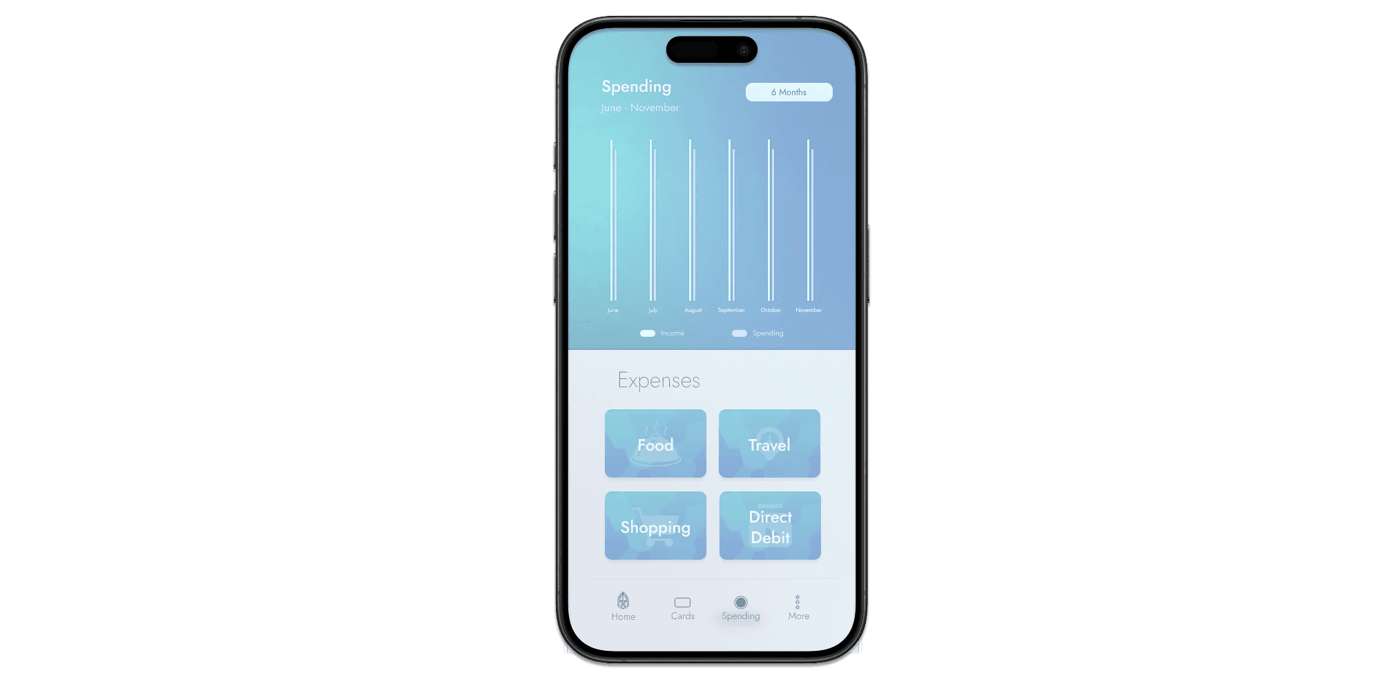
Description
A minimalist white-bar chart tracks six months of income vs. spending atop a calming aqua gradient, while large facet-style tiles invite users to dive into Food, Travel, Shopping, or Direct-Debit details.
Design Process Highlights
Colour & contrast pass – applied the brand’s teal-to-indigo gradient, keeping bars pure white so they pop without extra lines or shadows.
Button Style: Originally, the initial buttons had a gradient for their style. Although this worked well with the theme— an abstract splash pattern added another layer of style to the theme, avoiding the main style gradient feeling overused or redundant in the eyes of the user.
UX Principles Applied
Progressive disclosure: high-level graph first depicting numerical data to help users analyse their spending through visualisation. Deeper category spending is shown only when a tile is tapped, preventing information overload.
Send Money Flowscreen

Description
The flow begins with a “Send Money” screen that pairs quick-amount chips with instant card and recipient selection, shifts to a full-screen numeric dial for custom entry, and finishes on a calm review page that echoes the amount and avatar before a single, decisive Send Money tap.
Design Process Highlights
Quick-amount dial: Started with a numeric keypad, but guerrilla tests showed users preferred ± buttons for common top-ups; chips were then added for one-tap £25 and £100 increments to cut entry time in half.
Inline card selector: Radio controls live on the right edge of each card tile, preventing accidental taps on the logo while keeping the selection within the same visual block.
Avatar row & search fallback: A horizontal list surfaces the five most-used contacts for near-zero-friction transfers, while a compact search bar appears only when the user swipes past the row, avoiding clutter.
Transaction Sent: A final screen confirming with the user that the transaction has been gone through, offering clarity and immediate feedback.
UX Principles Applied
Fitts’ Law – The bottom-anchored “Send” CTA spans the safe thumb zone and exceeds 48 px height, minimising movement time and mistaps.
Visibility of System Status: The screen echoes the exact amount, funding card, and recipient photo selected earlier, reassuring users that the system retained their choices intact.
Colour Psychology: On the transaction sent screen, the addition of the green tinted gradient, not only indicates to the user that the transaction has been sent but also that the transaction was successful. Reassuring the user that they have finished their task.
AI Chatbot Integration
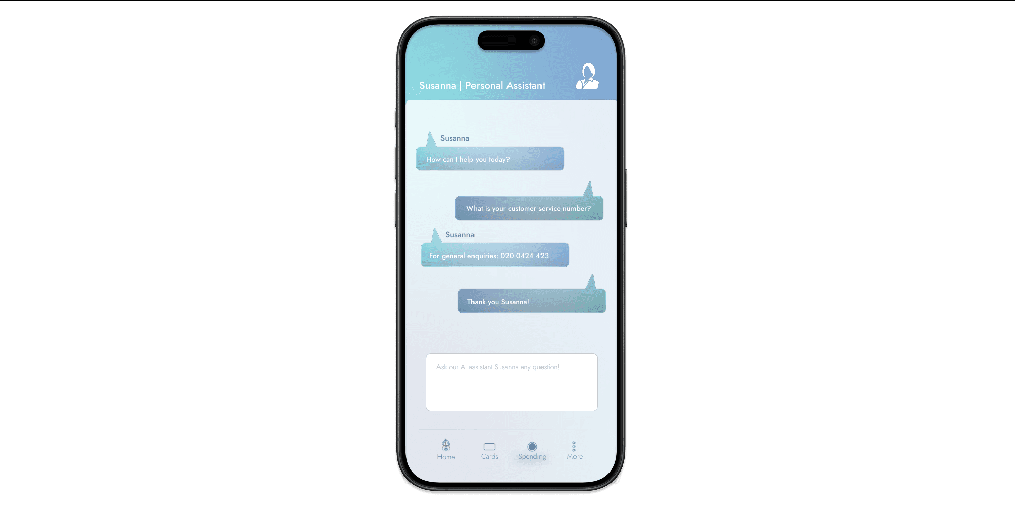
Description
With the rise of AI, it is important that stakeholders craft ways of implementing AI in their product, a generally safe approach would be to add a chat bot assistant that is personalised for the user.
Design Highlight Process
Conversational Clarity: Iterated message bubbles with subtle gradients and alignment to clearly distinguish between user queries and AI responses, enhancing readability and minimizing cognitive load.
Persistent Input Field: Placed the question box fixed at the bottom, allowing users to ask follow-up questions without scrolling, streamlining the interaction flow.
UX Principles Applied
Visibility of System Status: AI responses appear instantly within the chat stream, giving immediate feedback and reinforcing user confidence in the assistant’s responsiveness.
Consistency & Standards: Adopted familiar chat patterns and iconography from popular messaging apps, reducing the learning curve and ensuring intuitive use from first interaction.
Conclusion
Virtubank demonstrates how thoughtful UI design can turn financial stress into confidence by combining user-centered research, minimalist aesthetics, and platform-specific best practices.
Through intuitive flows, accessible visuals, and clear system feedback, this project showcases my ability to design engaging, high-quality user interfaces for native iOS and Android apps, aligning perfectly with Virtubank’s mission and the needs of modern FinTech products striving to deliver client-first digital experiences.
