Addify
Date
2025
Skills Applied
Web Design
Client
Solo Project

Overview
Addify is a web-based platform designed to bring people together through music in shared spaces like gyms, cafés, dorms, and public venues. Instead of relying on a single person to control the music, Addify allows everyone nearby to contribute, vote, and shape the playlist in real-time — creating a more inclusive and enjoyable listening experience for everyone.
This case study covers my full end-to-end process, including ideation, wireframing, prototyping, user journey mapping, and interactive design.
The Problem
Whether it's the gym, cafés, or dorm lounges, the music is often out of your control. Addify gives shared spaces a way to curate playlists together, democratically and in real-time.
Solution
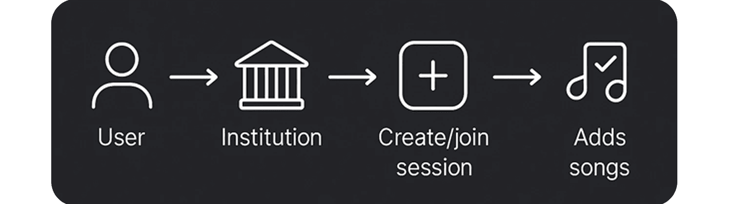
Addify was developed to allows users to create or join sessions tied to institutions, add songs, vote democratically, and personalize the playlist together.
My Process
Wireframes
Before jumping into high-fidelity designs, I mapped out the user journey using Miro to rapidly visualise core flows. The focus was to identify key screens and ensure a smooth path from landing to playlist engagement.
1️. Landing Page / Homepage
Where users first encounter Addify and can choose to create or join a session.

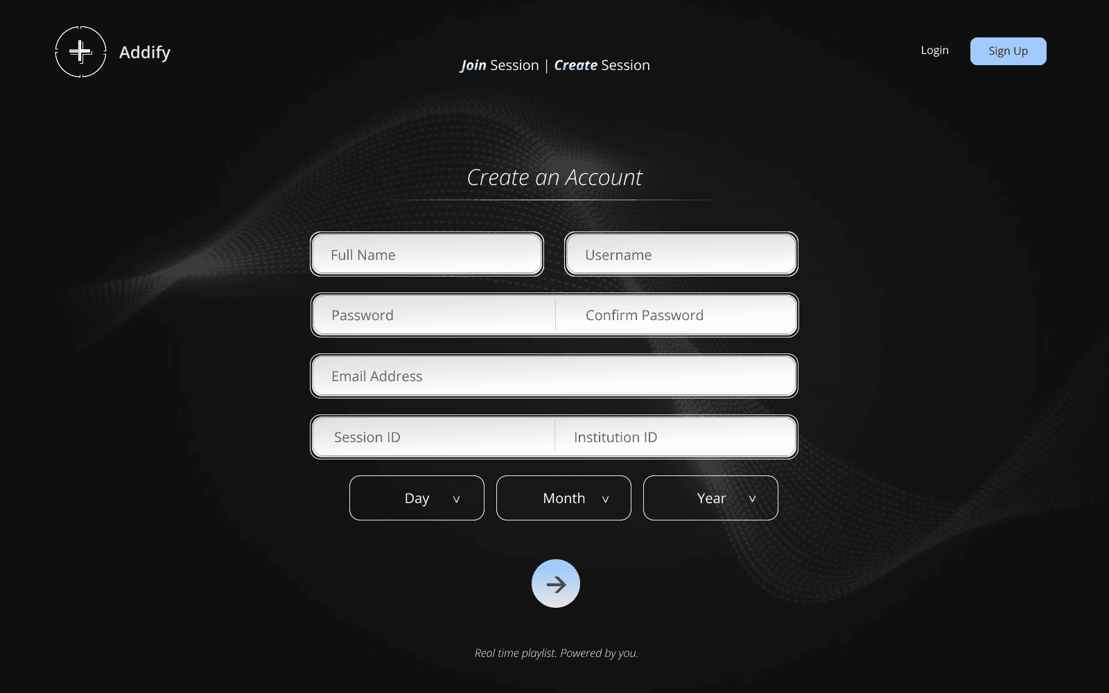
2. Create Account
Simple onboarding collecting essential info such as username, password, and institution/session ID.

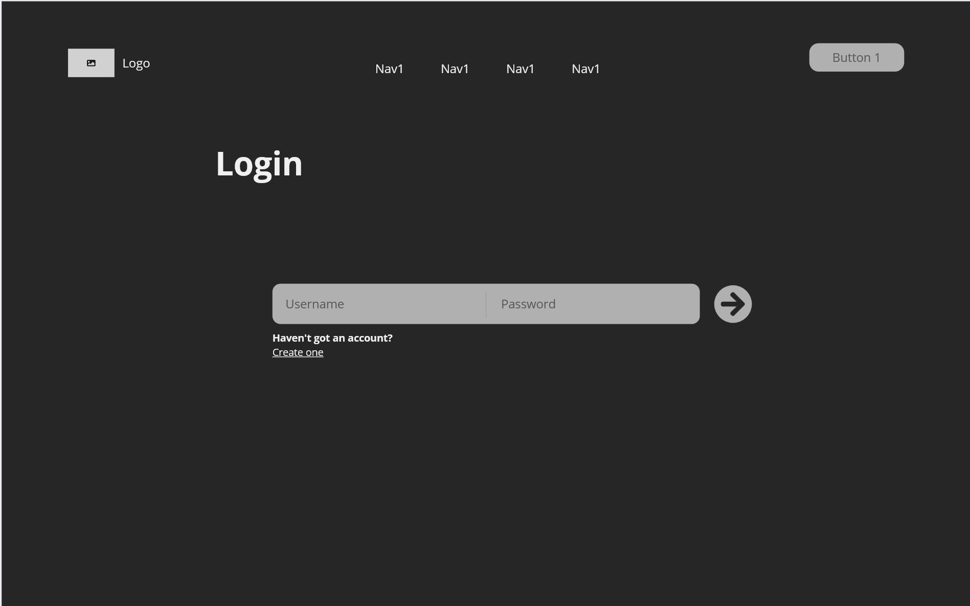
3. Login Screen
Returning users log in easily and can proceed to join or create sessions.
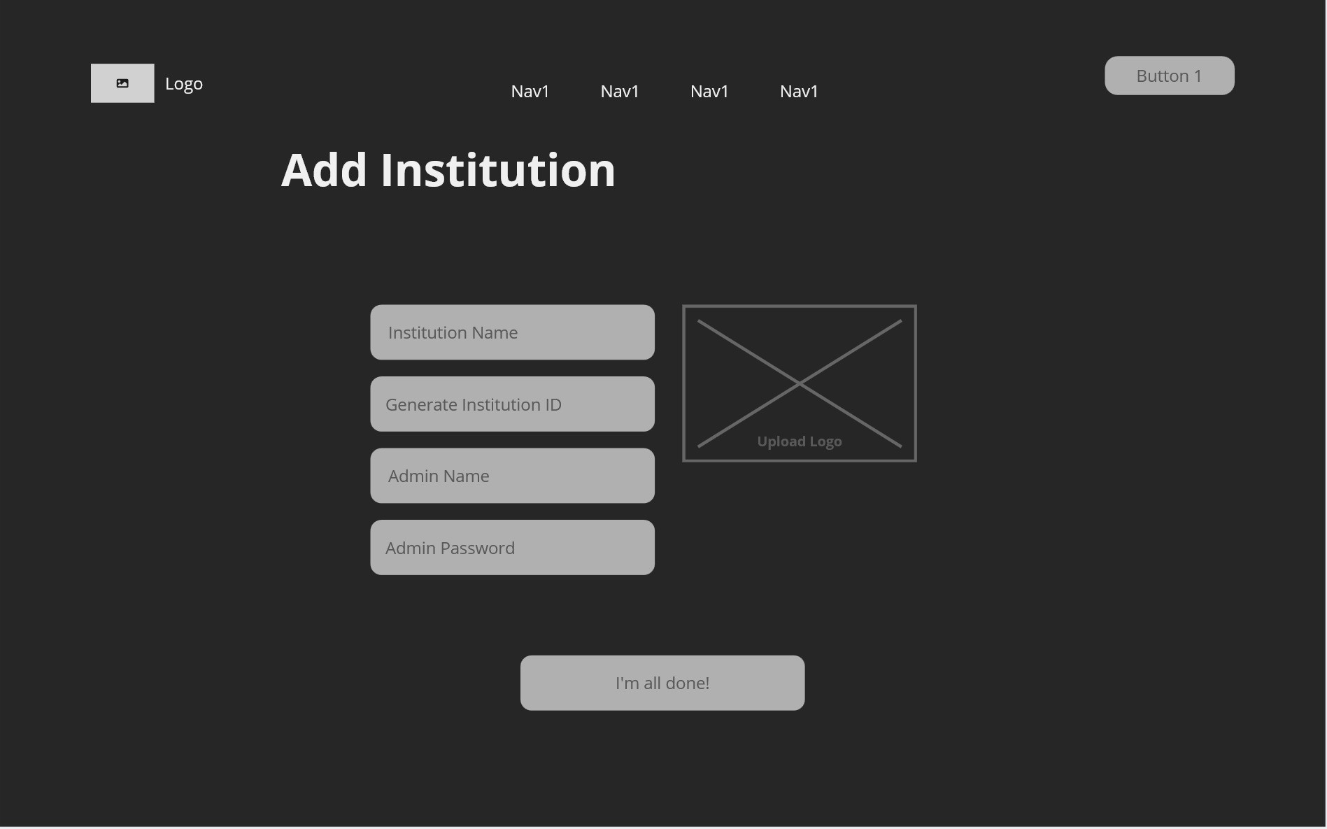
4. Create Institution
Admins can register their gym, café, or shared space and upload their branding.
5. Create Session
Admins configure their music session, apply moderation settings, and generate a shareable session code.

6. User Playlist View
The live playlist where users can see queued songs, search for tracks, and participate in voting.

These wireframes were intentionally low-fidelity to keep the focus on structure, functionality, and user flow. This allowed for faster iteration before investing time into the visual design phase.
UI Showcase: Giving Life to Addify
Once wireframes were validated, I transitioned into high-fidelity design using Figma, focusing on:
A sleek, dark interface with glowing silver accents (inspired by soundwaves and audio visualizers).
Simple, distraction-free layouts optimized for mobile-first interaction.
Smooth user onboarding while keeping institution/admin controls simple.
1. Landing Page: "Real-time playlists, powered by you."
A clean entry point showcasing Addify's purpose with instant access to join or create sessions.

2. Our Mission Section
A brief introduction to Addify’s vision: empowering users to collaboratively shape shared audio spaces.
3. Account Creation Flow
Clear, intuitive form design makes onboarding easy for both users and admins.
4. Login Screen
Minimal and efficient login for returning users. No fluff or clutter to overwhelm the user.

5. Create Institution
Admins can register their location (e.g., gym, café), upload logos, and generate unique IDs.

6. Create Session
Session hosts can configure moderation settings, queue limits, and manage user permissions with simple toggles.

7. Playlist Interface
Live session dashboard displaying queued songs, voting controls, and member lists in real-time.
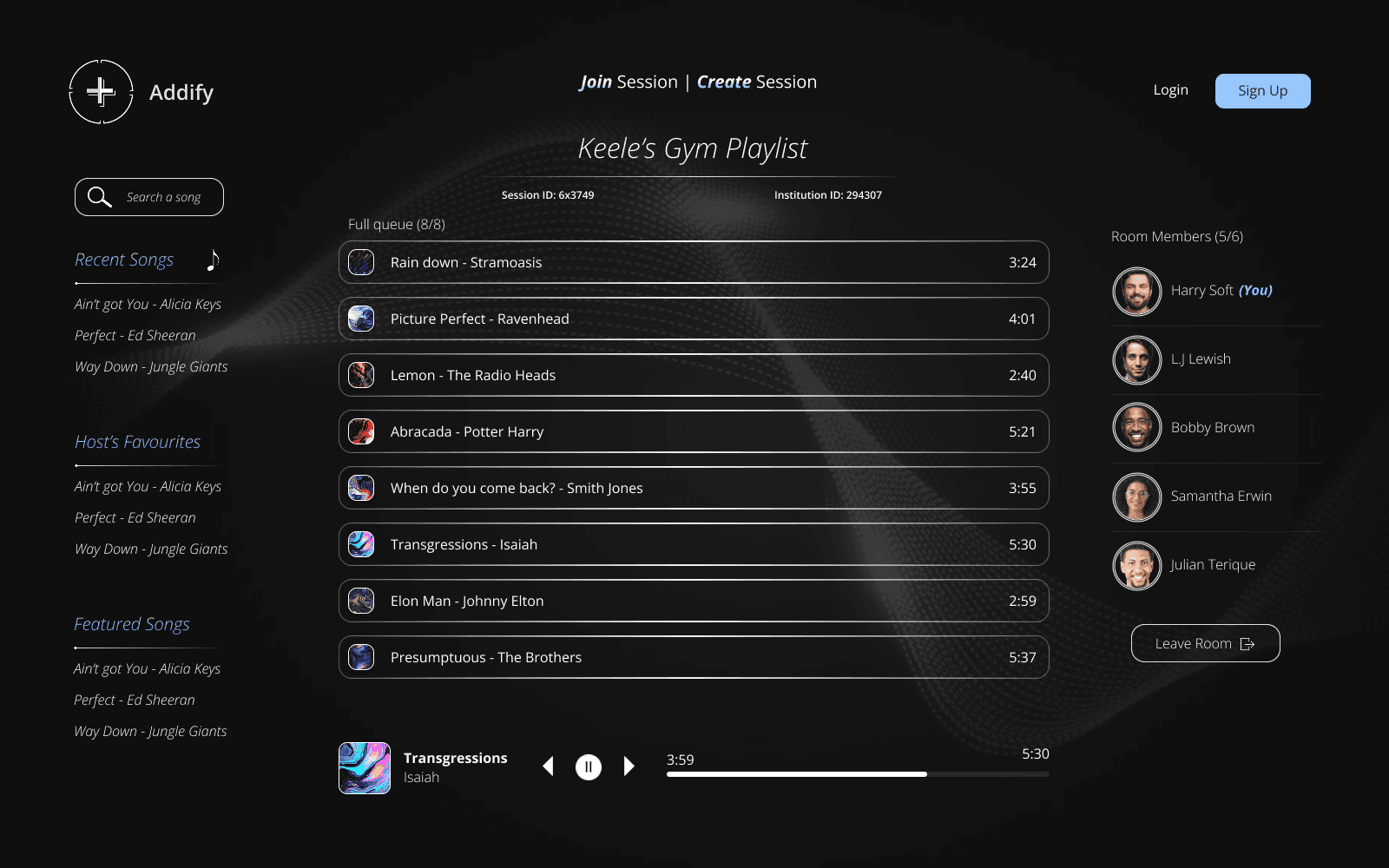
Each design leverages consistent iconography, hierarchy, and audio-inspired visuals to maintain a cohesive experience while offering strong functional clarity.
User Journey Mapping
To ensure Addify met real user needs, I mapped out a full user journey using a persona-based approach. This helped me visualize the key touchpoints, actions, emotions, and pain points across each stage of the experience.
Persona
Alex – Gym Member

College student who regularly uses the campus gym.
Wants to easily add songs and avoid boring, generic playlists.
Pain point: can't influence music when others control the playlist.
Journey Mapping

Key Insights Gained:
Simplicity is essential at every stage.
Reducing friction during signup (guest access, fewer fields) would improve onboarding.
Users love the voting interaction but want more transparency on how votes affect the playlist.
Admin features (moderation) should be designed to be easy to configure, even for casual users.
Reflection & Next Steps
Building Addify was an incredibly insightful experience that allowed me to explore the balance between personal control and collaborative user experiences within shared physical spaces.
Throughout the design process, I learned how to:
Simplify complex flows to reduce user friction.
Design moderation features that feel lightweight but effective.
Map out full user journeys from persona needs to final prototypes.
Rapidly prototype and test using tools like Miro (wireframes), Figma (hi-fi prototypes), and journey mapping.
One of the biggest successes was creating a clear, intuitive flow from landing page to session participation. Using a shine effect and the power of gradient helped add a layer of design that accompained the simplicity of the app's theme, the side-room panel made users feel more engaged with the music applicaiton, while the institution/session model allowed scalability across multiple real-world locations like gyms, cafés, and schools.